Sneaker Loyalty
Reviving and optimising the loyalty program for Foot Locker.


Background
The existing loyalty program had been a high abuse rate for the program, and relatively low engagement.
As project lead I delivered the customer segmentation strategy, procured and implemented technology systems and the communications design of the program.
Implementing a new loyalty program structure reduced incentive fraud by removing signup rewards, and offered honest users more rewards, more often.
Objectives:
remove opportunities for fraud by removing signup rewards
offer honest users more rewards, more often
integrate point of sale system
provide customer-facing staff and created segmentations around purchase behaviour and implemented a plan for ongoing CRM communications.
Solution
Segmentations were created based on purchase behaviour. A CXRM program with automations for customer on-boarding, new product and discounted product announcements and ‘sneaker lifestyle’ communications was created.
The mobile app (IOS and Android) were refine and new features were added to integrate the loyalty program in the app. These included replacing physical card or mobile number as the user ID with a digital loyalty UUID, and push notifications that were automated to delivering news on latest releases, drops of new product into a store near you, and your current rewards status.
Functionality included ‘reserve’ functionality for in-store purchases and ‘in-app reserve’ for online sales from the website or within the newly created ‘The Locker’ mobile app
Results
3 million segmented, targeted emails sent annually
39% Average Open Rate for triggered eDMs (23% benchmark)
6.7% CTR for triggered eDMs
99% of new signups are with our mobile app and result in no need for a card
‘The Locker’ members are 81% more active in-store & online than non-members
64% of ‘The Locker’ members earned a Silver Badge within 6 months (second purchase)
‘The Locker’ members spent on average $20 more per order
Health Hub
A healthcare program that recommends personalised dietary and supplements solutions for members.


Background
Our challenge was to create an online and mobile accessible ‘health hub’ where people could go to find helpful information about their health concerns and find handy products, nutritional and exercise tips to help them better their health.
Solution
On completion of the questionnaire, consumers were served with a range of products that may be suited to their profile, based around lifestyle, diet, and their own health expectations. The tool also automatically sent out a personal response email and personalised Pdf with information about diet, exercise, and invited consumers to register into a the ‘Health Hub’ to captures their health data (so they could return to it at a later date, or be reminded with an email, to see how they had progressed).
The experience was responsive, and was also plugged into the newly launched Nature’s Own web and mobile site, and iPads featured the hub at product conferences, pharmacy shows and toured with sales teams. While the new 'Health Hub’ intuitively collected consumers information, it also collected info on the products users were searching for to add further profiling on the basic’s of diet, likely routine of exercise and physical activity, and possible health or body concerns (stress, eyesight, muscular, sore joints etc)
Post Natal Care
Mobile application providing advice and confidence to first time parents.


Background
Panadol is the leading pain reliever in Australia and GSK’s flagship brand for portfolio revenue in Australia. I was the strategy lead for the agency services team for the account (team of 25) and client facing lead. I created the digital strategy that transformed their ecosystem to be digitally focussed; transforming their call-centres into social media management teams and launching two customer centered initiatives including a revolutionary app for mums with newborn babies, and a pain-management programme for the elderly.
The Children’s Panadol baby app became the most trusted and widely used baby application in Australia and New Zealand. Designed with a UCD approach the utility was released into the iOS and Android app stores in Australia, Indonesia and Singapore. I was the project director on Bub & Me and oversaw all phases of research, UX, design, user-testing, prototyping, design, build and delivery.
Results
The ‘Bub Tracker’ utility and Osteo programme increased Panadol innovation credentials across the portfolio. The app generated 600+ new users p/month through organic user acquisition, and 40% of all users scored over 20+ sessions after download.
For the Panadol Osteo Programme, subscriptions to the loyalty programme grew from 11k to 28k in 12-months, 56% increase in monthly sign-ups.
Exploring Vivid
A content discovery program encouraging play and social engagement to celebrate Sydney’s unique event.


Background
The brief was to create the digital platforms including the website, mobile site and app, leading a collaborative approach between the client, DNSW and agencies..
My role was to lead the UX, UI and design teams then supervise the art direction and development teams at DNSW.
The platforms requirements were to include a complete events planning tool that would allow users to either take a structured approach to their 18-days of activity (including over 200 separate events), or use the multiple versions of the map tool to find serendipity events nearby on any night and at any location.
All events, side-shows, lighting installations, music gigs, speaker events and more needed to be categorised, filtered and assigned into one of the several content templates.
As websites of previous years had demonstrated the need to cater for over a million visitors to the site, many of who were wishing to attend events on multiple nights, the planning tools and within the mobile app needed to be super quick and easy to use.
As visitors were of all ages and the site was a government website the site needed to be WCAG 2.0 compliant, mobile accessible and of the highest quality standard in usability.
Solution
I led the workshops with the cross-functional teams to design the digital user journey with teh objectives of enhancing the event experience, and providing relevant event information to stakeholders (media, NSW Government, partners).
The design process included the complete mapping of a user through the planning process, up to interacting/attending, and into the post-attendance phase where sharing your own content, photos, videos and reviews was obviously important for this multi-sensory event.
Multiple clickable prototypes of the site & app were developed during UX workshops and then user-tested to ensure navigation was streamlined for the major of user tasks on site. By including multiple navigation menus as the user scrolled down the page we encouraged more fans of music to venture into the Vivid ideas section, and vice versa.
By signing-in to the new ‘My Vivid’ section on the site, personalisation tools generated content for a handy recommendation tool – offering up music, events and speakers for you.
A personalised experience for each user could be customised by connecting with Facebook (or by submitting your details) and the tool proved popular for users looking to navigate while systematically building their event plan.
Other major improvements on previous event sites included:
calendar improvements, addition of cross navigation, and search
native mobile features including add to calendar, camera, and swipe functionality
on demand content feeds and smarter backend reporting capabilities.
Results
Vivid Sydney continues to break records as one of the world’s leading festivals, this year attracting an incredible 1.7 million attendees.
The site was promoted & accessed in Australia, Singapore, Malaysia, Hong Kong, and New Zealand.
Website results were:
1.6M visits and 227,064 leads (clicks off to event/partner websites)
Time on site 2.12, 3 pages per visit
App results were:
Vivid Sydney app (main utility app) downloads: 30,000
Vividsnap downloads: 30,000
Vivid snap usage: 84,834 app launches, average use of 2.5 times per person, 14,237 vividsnap images created with 3,380 being shared via social channels
Key features of the Vivid Sydney mobile apps included:
a native platform build
ability to log in with Facebook, Twitter and Google
social account sharing - populating with friends’ Vivid activity
RMS/Transport NSW map with road closures etc.
a link to buy tickets on all applicable event pages
urgent campaign message/announcement capability
advanced reporting & detailed user data – devices, visits, favourite events, time spent in app, pages visited etc
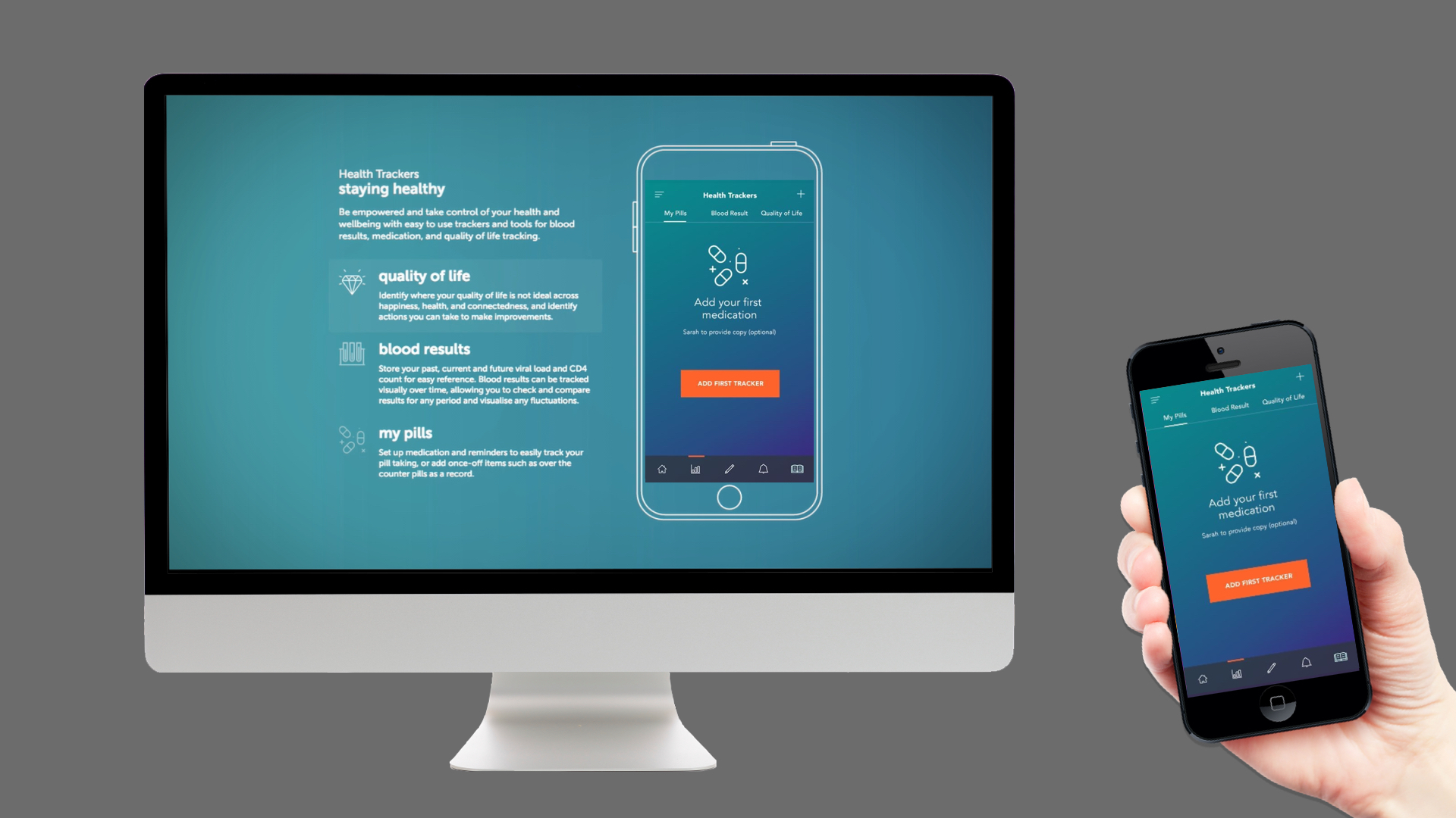
My Life Plus
A program to assist patients living with HIV better manage their condition and lifestyle.


Background
There are currently around 30,000 people in Australia living with HIV. Advances in treatments means HIV patients can now live long healthy lives if they adhere to a strict regimen and manage their virus efficiently and the main issue HIV patients face is that doctors are not always proactive in reviewing their patients. This is due to short consultation windows and patients not being outright with their doctors about concerns or mishaps due to patients not accurately recording and tracking their medical information. This results in consultations not always being conducive of enhancing patients treatment and patients not being properly educated on how to efficiently self-manage their lives living with HIV.
Efficient HIV management involves a strict regimen inclusive of remembering to take multiple pills daily, attending monthly visits to their doctors and specialists, day to day tracking and documentation of their pill intake, blood results, quality of life, moods and mishaps. Through comprehensive qualitative and quantitate research we also found majority of HIV patients struggle to adhere to a strict routine due to a vast array of external factors ranging from drug abuse, poor finances, poor advice and just generally being overwhelmed with information.
We found patients are also using a vast array of online and offline tools and techniques to manage their routines, documenting some things on paper, some on their mobile devices in un-secure environments and otherwise forgetting to document at all – thus resulting in not being able to properly educating their doctors during consultations, forgetting to take their pills and a generally lower quality of life.
Solution
MyLife+ is specifically developed to assists patients in keeping track of their health, medications, blood results, and symptoms daily while also reminding patients to take their pills and attend appointments on time. With MyLife+ patients can now obtain more comprehensive reviews, plans, information and support.The app is continually updated with health advice curated by NAPWHA, allowing patients to obtain more comprehensive research, information, reviews, plans, information and support. NAPWHA have also endorsed the MyLife+ mobile app.
MyLife+ has been designed with security and privacy top of mind with patients personal information only available through the password protected interface and their personal information stored securely on their own device. Patients can share their private information directly with their health care professionals manually through secure encrypted emails. MyLife+ mobile app empowers patients with the tools and self- confidence they need to better manage and track their regimen and make more informed choices in self-managing their HIV treatment.
Redesigning the Online Process for SMEs to Apply for R&D Tax Incentives
A program to streamline the process of applying for a government grant for scientific research and development.


Background
Applying for tax concessions to fund innovation is difficult.
The Australian Government required a greater number of small businesses to apply for tax concessions for research and development to meet budget-spend requirements.
The issue was that although the government had a stockpile of monetary concessions to encourage innovation in small businesses, the requirements, criteria and process was daunting and complicated so not many businesses knew how to, or could follow the complicated process, to apply.
Solution
The process included:
focus groups with the target audience and those working in the field.
content audit and analysis
analytics review
trends review
UX and information design
content script writing and production website design and development
Working with several government departments and over thirty stakeholders we first simplified paperwork and process requirements to eliminate 4 major steps in the previous process, making the new application process simpler and easier to navigate.
An end-to-end user-experience testing program then ran over six weeks. This program involved prototype testing on desktop and mobile, video recorded interviews, and live- prototype revisions to test new tools that were then added to the portal including:
a ‘Jargon Buster’
an R&D Tax Incentive Calculator
a Quick Tips tool
a ‘Find a Research Service Provider’ tool (there are 189 RSPs in Australia) a ‘forms tool’
animated video & podcast series
Results
The complete R&D Tax Incentive program and application was simplified into a 6-step online process - which was also then adapted into call centre scripts. The process that used to take an average of 30 days was reduced to 30 minutes allowing small business owners and innovators to more easily access funds and incentives for innovation.
In the first 10 days following launch there were 27 news articles and reviews promoting the new portal and accessibility as the ‘Next Big Thing Ahead’ for making innovation funding super accessible, with news coverage appearing within The Sydney Morning Herald, The Australian, The Australian Financial Review, New Life Scientist, and News Asia.
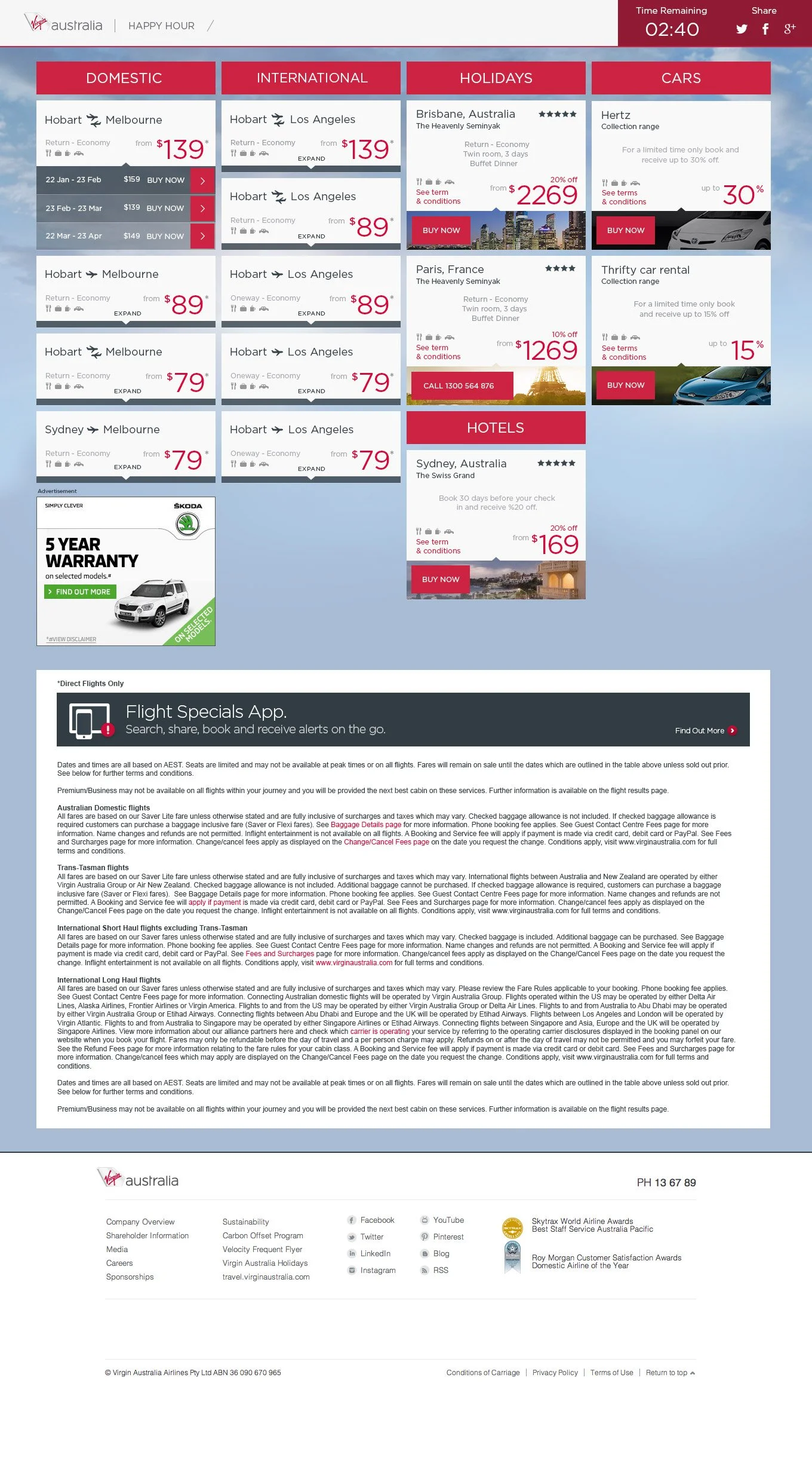
Virgin Australia Happy Hour
Strategy
Re-launch Virgin Australia’s “Happy Hour” campaign across digital channels and provide a robust bookings portal that can handle a large volume of traffic and ecom bookings every Thursday from 2pm to 6pm.
Background
The “Happy Hour” campaign is an on-going initiative for Virgin Australia. After being paused for a lengthy period of time due to travel restrictions the campaign was being re-launched and required an updated user experience and new visual design.
The customer for “Happy Hour” is your typical bargain hunter and can come from any demographic. They have, however, a single need in common and that is to get good value for money.
Solution
There was the opportunity to tailor email marketing further to this audience. Most consumers will have “favourite” deals, such as flights to Perth, for example. A later phase of the project included providing users with the ability to tailor their email preferences, by “favouriting” particular deals. When a “favourite” deal is available on Virgin, their eDM highlighted this.


Uber Driver & Delivery Partner Onboarding Program
Background
Feedback from first time drivers and delivery partners for Uber showed that onboarding and first time delivery experiences were adrenalizing, challenging, a little bit risky...and a little confusing.
There were challenges and a quite often more than a few daunting moments.
Examples of delivery / driver experiences:
“The app sent me all the way to Chippendale. At peak hour. It was a long way in Sydney traffic!”
“I didn’t know where to park my e-bike so I could lock it up.... and if it would be there when I got back!”
“When I picked up groceries to deliver I didn’t know where to go, or who to ask. I had to wait. I just wasn’t sure!”
“Trying to avoid touching your phone while driving is really difficult - I was constantly faced with the dilemma of doing the lawful thing vs accepting a trip or checking the GPS route...”
The goals of this CRM project were to:
make delivering the first time a good time by celebrating key milestones,
make delivering the second time a better time by empowering delivery riders/drivers with helpful tips to make their experience safer, more efficient and more enjoyable,
make delivering the tenth time a time to reflect and provide other delivery riders/drivers with helpful tips and your own experiences to make the communities experience safer, more efficient and more enjoyable.
Solution
Mapping of first time experiences using feedback and qualitative research from driver and delivery partners captured after their first day, week and month of working with Uber.
Creation of time based email and sms CRM program and community fed knowledge hub of FAQs, tips and tricks to better the onboarding experience.
Delivery Partner (e-bike experience delivering food and groceries)

Timed / Trigger Based Email Program for Delivery Partners (e-bike experience delivering food and groceries)


Driver Partner (driver experience delivering passengers, food or groceries)

Timed / Trigger Based Email Program for Driver Partners (driver experience delivering passengers, food or groceries)


The Gold Coast Commonwealth Games Platforms, CRM and Ticketing Hub
Background
The Commonwealth Games is one of the world’s most iconic sporting events. With the 2018 Commonwealth Games fast approaching, an official website needed to be created.
My brief was to lead the UX and navigation design and personalisation of the user experience of the website for ticket holders and athletes. The platforms were required to meet the highest levels of accessibility across all platforms. devices and browsers and required the capability to support over 10 million visitors per day from 54 countries, 18 territories and in 14 languages.
Solution
Leading the collaborative UX phase with the Commonwealth Games team I led agile workshops with the output being customer/user journey sets and sketches of key JTBD interfaces for users of the web and mobile sites. I then led drafting of IA and wireframe development and directed visual concept and user interface design teams.
From a technology perspective, the website was architected using the Drupal CMS, hosted on the Acquia Cloud Platform. This technology stack was the same solution as used in the design and development and content management of the Rio Olympics, Sochi Winter Olympics, the Grammys along with large publishing platforms such as MSNBC.
The site development was responsive across all devices, and was editable by the client through the CMS, with multiple user permission levels to enable content producers throughout the event to write and upload content.


